Choosing colour in your home
 17
17Jul '14
With a bewildering array of choices for your new kitchen, bathroom or bedroom – the last dilemma always remains – just how to individualise the room with colour?
Inspired by quick-makeover shows, it seems all-too-easy to throw on a quick, bright fix and then spend months regretting it.
KBSA member Tina Riley from Modern Homes in Leamington has some advice to help you use colour in your home in a way that adds style and provides the right ambiance.
“Colours have deep subliminal meanings that affect our thinking and rationale so it pays to spend some time considering how to make things work properly for you. We’re faced with colour choices on a daily basis – from deciding what to wear through to our décor. It therefore makes sense to do a bit of research and planning before splashing out on new paint or wallpaper.”
Tina’s advice is to think about the colours that appeal to you in daily life. Look at your clothes, car, furniture, and fabrics that you surround yourself with. This should help you decide on a palette that feels right.
“Nature is also a great inspirer,” says Tina. “Colours that appear naturally in nature will always blend well together, and in your house interior. Earthy tones of greens, browns and creams would be ideal to create a relaxing, peaceful environment, but remember that whatever the colour, the darker the shade you use, the more obvious and dramatic it becomes.”
Take inspiration from Tina’s colour analysis for the rooms in your home:
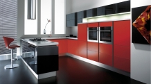
Red- vibrant, warm and energetic. A great colour for kitchens- red has been shown to increase appetite in most people. This is often the reason that many restaurants choose some form of red for their dining rooms!
Yellow- inspires optimism and feelings of wellbeing. A great colour for a sunroom or even the hallway or porch. As you leave or enter the house, you get a burst of optimism and positivity.
Purple- although purple signifies wealth and romanticism it’s a colour not often found in the natural world, and can look very artificial. It works best if blended with more natural colours like yellow and green.
White- this symbolizes fertility and cleanliness which makes it a perfect base colour for bathrooms. It’s easy to clean and knowing your bathroom is clean and fresh can put your mind at rest and aid relaxation.
Green - inspires concentration so very apt for a home office environment where the faster you get your work done the sooner you can spend time with your family (or go out!).
Blue- is a calming colour that shows creativity and intelligence. It is a colour that looks good in almost any shade and can also be a very popular colour with males. It is a good colour for relaxing in escape rooms, bedrooms and bathrooms.
And having chosen your ideal palette, one last word of advice from Tina; “If you’re painting a room – try sample patches of colour on every wall, as they can look different in different lights. You need to make sure you like the colour all around the room. Feature walls are great as focal points, but if it’s a very deep or bright colour – use it sparingly. Remember – whatever your choice, you have to look at it on a daily basis!”
CAPTION Futura Red Silk & Black Gloss from the Cucina Colore range at Mereway Kitchens www.merewaykitchens.co.uk
Telephone: 01384 878777 Fax: 01384 872104 Email: info@ddpr.biz
Enquiries: Downing Dunmore PR