What Your Kitchen’s Colour Scheme Says About You
 15
15Jan '16
With colour comes feeling. With colour schemes comes emotion. The colour schemes that we choose are what grants each room its own unique identity.
It’s for this very reason that colour theory has been at the very heart of interior design since interior design first began. The colours we choose and the methods in which we pair them determine the very feelings you’ll evoke in yourself and your guests when you’re in that room from that point forward.
The Theory Behind Colour Theory
Colour Theory provides separate strategies to which designers can create a scheme of colours. These theories can apply to anything which combines two or more colours: websites, fashion design, art painting and, indeed, interior home design.
As you can see in the infographic above, there are a selection of the sound strategies frequently used to combine colours from the central colour wheel- derived from divided light and the formation of all shades, hues and saturations of colour visible to the human eye.
Analogous colour schemes combine two or more colours that sit next to each other on the colour wheel. On the wheel above, an example would be yellow, light green and dark green, however on more focused, in-depth wheels, may simply refer to three varying shades of green. Analogous schemes naturally appeal to the eye, however are in danger of being very monochrome if not paired with an accent, such as white or cream.
Complementary colour schemes combine two colours which are direct opposites on the colour wheel. On the wheel above, an example would be orange and indigo, which sit across from one another. More focused wheels will resemble this one in the pairings, but with greater variation of shades. Complementary schemes are superb at highlighting particular points of interest, however in large areas will appear garish and highly off-putting. Best not used with full saturation of colours.
Triadic colour schemes combine three colours which are an equilateral triangle apart on the colour wheel. On the wheel above, an example would be purple, dark green and dark orange. More focused wheels will grant you a greater scope of shades. Triadic schemes are advances schemes best used for large rooms and areas. To use them successfully and avoid chaos for your eyes, one colour should be highly prioritised, with the other two adding accents, rather than being foundations in the scheme themselves.
There are other more complex schemes such as four-colour rectangular themes, which you can see examples of above but these tend to be more specialised designs for grander, multi-room designs.
How We Form Our Associations With Colour
A whole host of factors have combined to conclude our conceptions of emotional connection in colour.
These include…
Social: Depending on your location, some colours carry an extra meaning that has been developed over a long period of time. Red- nominally a colour associated with danger- is perceived to be healthy and lucky in China. Brown, a grounded, neutral colour in western culture, is worn by those in mourning in India. These are just some examples on how culture and society can affect colour perception.
Physiological: It’s a scientific fact that the physical properties of light wavelengths can have differing effects on our mood and even brain waves. Red, being the longest wavelength, is easily the most visible colour and the harshest on our eyes. Long exposure to saturated red can cause headaches. On the opposite end of the scale, Blue produces a well documented calming effect on us, slowing both heart rate and metabolism.
Natural: Our experiences with nature can bias us towards or against certain colours and combinations of colours. Yellow and Black is a combination we ruefully associate with danger due to the many dangerous and poisonous creatures- wasps, frogs, snakes - whom inhabit our planet Earth with those colours. Meanwhile, Green as a base colour is seen as harmonious due to its unbreakable association with nature.
In addition to these broader categories, any number of personal associations, such as
memories can mould our perceptions of colour and grant meaning. The typical associations of Dark Purple- that it is a gloomy, frustrating colour, may not be true if you have fond memories of toys or clothes in that colour from your childhood. Equally, a favourite gift given to you that was a certain colour could lend your affections strongly towards it.
That said, there are certain typical consistencies regarding the meaning of colours. Whether these have originated in nature, culture or physics, they’ve become synonymous with these meanings and if you’re planning on a new scheme for your new or current kitchen, have a glance at what your colours will be saying about you…
The Meanings Of Colour
White is a very popular shade found in contemporary and traditional kitchens alike, due to its common association with:
- Cleanliness
- Sterility
- and Safety
It’s also a very good accenting colour to match stronger and more vibrant colour combinations, such as red and orange. In fact, you’ll rarely find an interior design colour scheme involving red which does not also involve white, cream or magnolia. White can more or less go with anything and any kitchen with white in its design will benefit from a sense of sophistication in their kitchen.
Black is a polarising shade which carries connotations of evil, death and depression and yet has become a very sleek and stylish choice in fashion, business and kitchen design combined. In addition to its negative points, it also brings to the table:
- Elegance
- Power
- and Decadence
Black kitchens can look very stylish, however tend to come borderline monochromatic, with only white and brown really used as a minor highlighter. This is because black combines very aggressively with other colours, especially red and orange, leading to a very loud, stressful scheme, as the strength of the colour will not be offset by the black. For this reason, black kitchens tend to exist monochromatically or not at all.
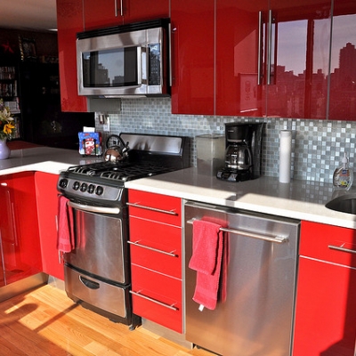
Red, due to its status as the colour with the longest wavelength, can appear very fierce indeed if not offset by the calming influence of a shade of white. Frequently found on country’s flags, red is a symbol of…
- Love
- Power
- and Danger
In addition, it also strongly represents potently powerful ideas, such as fire and blood. Red, as alluded to above, can easily become overwhelming to the human eye in high dosages. It’s a colour which notably raises blood pressure, your heart rate and your respiratory rate. One with a red kitchen conveys a loud, boisterous kitchen—the interior design equivalent of fashion’s fur coat.
Orange kitchens are best served with a pale, soft hue as, alike red, at its full saturation, it’s a loud and proud colour which can easily become an eyesore, particularly at the end of the day when you’re looking to cook and unwind from work in peace. Similar to red, orange is a stimulating colour, increasing oxygen levels to the brain and giving the impression of heat. However, as orange is already a highly promoted colour in food produce, there is a risk of it clashing with your food. Orange symbolises…
- Enthusiasm
- Warmth
- and Creativity
Yellow is a polarising colour which can symbolise joy and happiness but can also become distressing and ugly, particularly if it’s allowed to become dirty and dull. Yellow is also traditionally the worst colour for matching with white schemes, due to its nature to bleed into the white. Therefore, a yellow scheme usually demands a darker offset- such as a brown. At its best, yellow represents…
- Joy
- Energy
- and Freshness.
Moving on to the cool colours and green is fine choice for those in the market for a relaxing cooking experience. It is the least taxing colour on the human eye, and its immediate association with nature suggest a harmonic & balanced room, with the potential for things to grow. One small pitfall to green is it’s darker brethren which has an unfortunate association with wealth and money, due to the American Film Market. True, natural green represents…
- Safety
- Hope
- and Healing.
Blue was voted in a landslide the world’s favourite colour earlier this year. A calming colour of depth and promise, it has an unbreakable association with the vast serenity of the sea and the sky. It’s a traditionally masculine colour and the darker variants have become ingrained in corporate America. Social Media, sans YouTube is almost entirely colour schemed with blue.
However! One thing we’d be in gross error not to mention with regards to kitchens is that blue has been found in scientific research to suppress appetite, and is, as such, almost entirely never found in relation to food promotion. Equally, there are very few naturally blue foods. Whether this factors as a deterrent or an encouragement to go with a blue kitchen remains to be seen. Blue connotes…
- Intelligence
- Trust
- and Stability.
Purple is traditionally a regal colour, associated with royalty but has seen a surge of popularity in the 21st century. It is a popular colour with young people and is seen as an ideal blend of the stability and serenity of blue with the energy and passion of red. Lighter shades, such as lilac or lavender are associated with romance and femininity. Darker shades tend to connect strongly with nobility and power. Equally, purple is a very rare find in nature, leading it to be perceived as a civilised, human colour. Its connotations include…
- Creativity
- Dignity
- and Extravagance.
Conclusion
When selecting which colours to mix into a scheme using one of the methods above, and in turn creating the emotion behind your kitchen, we encourage you to experiment and blend various colours together to find your ideal blend. In addition to the guide here, other resources around the web at your disposal include:
About.com’s Colour Guide: http://desktoppub.about.com/cs/color/a/symbolism.htm
This provides some more information on the connotations of colour and breaks down more popular colours- such as red and blue- into shades for you to consider. Another useful tool is:
Dulux’s Room Painter Tool: https://www.dulux.co.uk/en/visualiser
This handy little app allows you to digitally paint the walls of a series of rooms with a large colour pallet, so you can compare different schemes and see how the combinations practically appear once applied together.
Whichever colour suits you and whichever scheme fits you, there are no wrong answers here. A new or an improved kitchen is a big investment, which is why we encourage nothing but what is absolutely right for you. You can have a browse of our kitchen gallery for even more inspiration and when you’ve found the right scheme for you, drop us a line by mail or by phone and our dedicated team will get to work in pairing you with a local KBSA quality approved retailer in your area.
Together, we can find the right kitchen for you.